Corner Kingdoms
Game
More
Game
Image to Dots
Web Application
About

Info
This website is much cooler if you're on a desktop by the way.
WORK IN PROGRESS

Corner Kingdoms

Game

More

Game

Image to Dots

Web Application
About

Info
Drag Me.
I'm a 25 year old game programmer and designer, and I've been making games for 9.429559733 years. I published my first app on the Google Play store in 2016, and I'm currently working on an assortment of different projects with a focus on finding a job in the tech space and bettering myself as a programmer and devloper.
I built this portfolio website to showcase my abilities as a web developer. Here, you can explore some of the projects I've created using skills I've developed over years of determined self-learning. I wanted to make something unique and since I make games, I thought it would be cool to make a website that feels like a game. I hope you enjoy it!
I have a strong perseverance for learning new things and taking on challenges, and I always like to put some extra time in polishing my creations, to make sure the creative vision is achieved in the best possible way. I've always been extremely curious in the technical side of games, and sometimes this curiosity has led me to projects I won't be able to formally mention here... cough.
If you have any questions please feel free to contact me :)
Check out some more of this website
Or check out my
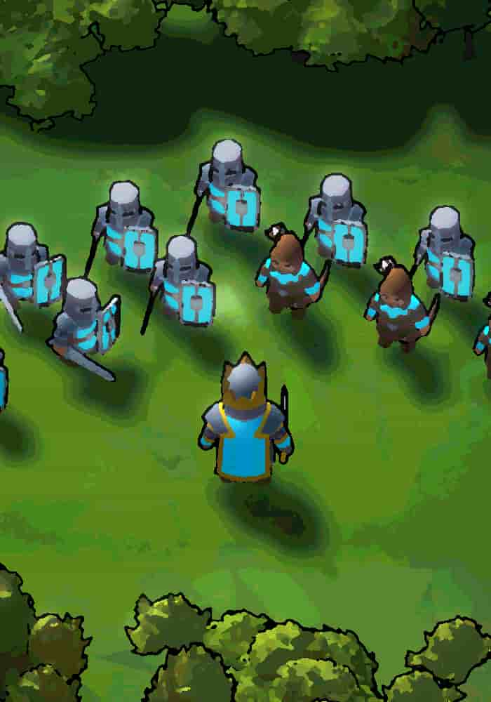
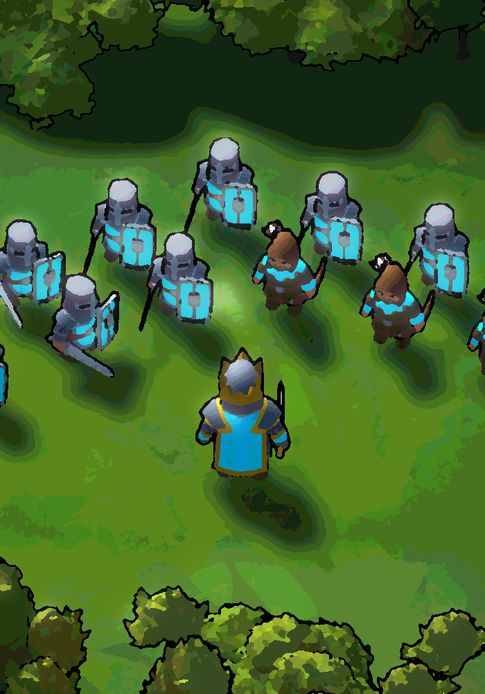
Corner Kingdoms is a splitscreen RTS game where players build up their kingdom and fight against their opponent. The game is built in Unity and started because I wanted to expand a previous similar project named Birds and Blades. The game is currently in development.
I have a couple development videos on the process of making this project.
Players and units alike move around the map on a Unity NavMesh. This allows for easy pathfinding and movement. As a comparison, the previous game I made, Birds and Blades, didn't use a pathfinding system.
The units only moved in a straight line from point A to point B. This was a lot easier to implement, but it didn't allow for any sort of interesting movement: walls couldn't be added, and units couldn't move around each other. It just made for a cluster of a battle.
With the NavMesh, units can move around each other, and the player can add walls or towers to block their opponent's units.
To save on performance, the NavMesh is only generated once at the start of the game. This way, the NavMesh doesn't have to be generated every frame. And obstacles like walls and rocks use what's called a "Nav Mesh Obstacle" that cuts out a section of the NavMesh so that units can't move through it.
The Movement system is also designed with reusability in mind. I use the same movement system for both the player and the units. This way, I don't have to write 2 different movement systems, and I can easily add new units or creatures to the game.
// BOX FORMATION MATH
float row = Mathf.FloorToInt(i / boxWidth);
float column = i % boxWidth;

// only apply if unit is in the last row (centering)
if (i >= lastRowStartIndex)
    column += remainderInLastRow / 2f;

Vector3 dir =
    transform.forward * (row + 1f) * patternSpacingMulti +
    transform.right * (column - boxWidth / 2f) * patternSpacingMulti;

dir = MaxPosWithHit(dir); // limit the position to only be on the NavMesh

SetUnitPos(unitsToRally[i], dir, unitsToRally[i].GetStats.maxMoveSpeed);
Another cool aspect of the movemnt is the formation system that I added. You can hold a button and cycle through various unit formations.
The combat in Corner Kingdoms is a simplified version of an RTS game. The player can select their units with a circle that adds to their current selected units.
private void SelectNearbyUnits()
{
    float distanceToPlayer = (unit.transform.position - transform.position).sqrMagnitude;
    selectedUnits = PlayerHolder.GetUnits(identifier.GetPlayerID)
        .Where(unit => distanceToPlayer < currentSelectionRadius * currentSelectionRadius && unit.GetIsSelectable).ToList();
}
The reason I use "sqrMagnitude" and not "magnitude" is because "magnitude" squares the calculation automatically, making the process slower. So if I just compare "sqrMagnitude" to the radius squared, I can get the same result, but faster.
And keeping the theme of simplicity, I went with a 1 button approach to combat. Once your troops are selected, you can click the "Rally Troops" button to call your selected troops towards your location. Depending on where you're standing and where your troops are relative to enemies, the troops will attack the enemies.
Staying in the realm of troops attacking enemies, there were some interesting technical difficulties that went into units finding the nearest enemy...
When you have hundreds of units on the screen, it can be very taxing on the CPU to have each unit check every other unit to see if it's the closest. You have to loop through every unit, and then loop through every other unit to see if it's the closest. This is an O(n^2) operation, and it can get very slow very quickly.
So to combat this, I implemented a spatial grid. The Spatial Grid is a 2D array of lists. Each list contains all the units that are in that grid cell. When a unit moves, it checks to see if it's grid cell has changed. If it has, it removes itself from the old grid cell and adds itself to the new grid cell. So when a unit wants to find the nearest enemy, it only has to check the units in it's grid cell and the surrounding grid cells. This is a lot faster than checking every unit on the map.
private void CellFindNearestEnemy()
{
    int cellsOutToCheck = Mathf.CeilToInt(lookRangeWithHeight / UnitCellManager.cellWidth);
    Cell activeCell = UnitCellManager.GetCell(transform.position);

    Vector2Int bottomLeft = new Vector2Int(activeCell.pos.x - cellsOutToCheck, activeCell.pos.y - cellsOutToCheck);
    Vector2Int topRight = new Vector2Int(activeCell.pos.x + cellsOutToCheck, activeCell.pos.y + cellsOutToCheck);
    Cell[] cellsAroundMe = UnitCellManager.GetCells(bottomLeft, topRight);


    SetNearestEnemy(ReturnClosestEnemy(cellsAroundMe));
}
This change severely reduced the complexity of finding the nearest enemy . This is a huge improvement, and it allows for a lot more units to be on the screen at once.
The UI is designed to be simple and easy to understand. I wanted the barrier of entry to be as low as possible, and when designing an RTS game, this can have it's challenges. I think I've done a good job of making the game easy to understand, while still having a lot of depth.
As the base UI, the player can see their resources (current and income/min) and the amount of units they have. I like to have UI only show up when necessary as it removes confusion for newer players and makes the game feel more immersive. So when the player selects a unit, the UI changes to show which units are selected. Same goes for queuing units, the UI only shows up when the player is queuing units.
UI shows up for when units are queued
UI shows up for when units are selected
And for the build menu, every RTS game that I see always has such a complicated build/upgrade menu. I think when you're playing a "party game" with friends, you don't want to have to spend a lot of time learning the game. So I wanted to make the build menu as simple as possible as well.
When first opening the build menu, the player is presented with only a couple buildings. A way that I achieved a simpler build menu is through an upgrade system. The player can upgrade their buildings to change the building in some way.
For example: a player places down a house to increase population. From there, they can upgrade this house into a village house, an archery range, or a blacksmitch. This way, the player doesn't have to learn what each building does, they can just upgrade their buildings to get the desired effect and thus a simpler build menu.
The map is procedurally generated every game. Certain elements of the map don't matter as much due to a surplus of resources, like trees. Those are generated using the Perlin Noise algorithm.
But other elements that aren't as common are generated with a grid division algorithm. This algorithm divides the map into a grid, places at least x objects in each cell, then randomly places objects in each grid cell. This way, the map is always different, but resources are distributed evenly.
In Birds and Blades I just randomly placed objects on the map, but this led to the map being very unbalanced. Simply put, the location of your spawn heavily dictated who would win the game. So I wanted to make sure that the map was balanced, but still different every game.
SOME
OTHER
STUFF
Game
Birds and Blades is another splitscreen RTS game built in Unity. It's kind of like the
predecessor to Corner Kingdoms. I would say it's more complete as an all around game, but
Corner Kingdoms is more thought out with it's mechanics and design.
Web Application
This website was one of the first working websites I made. Its purpose was just to publicly
display my steam stats. It's a website that uses a
server side script to send SteamAPI data to the frontend
using Firebase Functions.
Web Application
A website that uses the
Liquipedia API to get data about the game Rocket League.
I use that data to make my own API to send data in a
more usable format to the frontend.
Some context: JohnnyBoi is a Rocket League caster who hosts showmatches (1v1 tournaments) with the best players in the world. I wanted to make a website that displayed the upcoming showmatches in a more user friendly way than the liquipedia page.
This website uses liquipedia's api to fetch data from the JohnnyBoi_i/Broadcasts page and subsequent match pages. I have to cache the data because of the restrictions on api calls. The data retrieved is basically just the page's html, so I use the jsdom npm library to parse the html on a back-end server.
This website is not active due to financial reasons, but you can read more about it and check the source code HERE!
Web Application
I started this project to learn about WebSockets and
Node.js. It's a website where you can join a lobby
(quick join / private) and draw against other people in an elimination style game.
It uses socket.io and
peerjs to send data between clients.
Inspiration from this project came from the website skribbl.io.
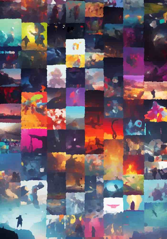
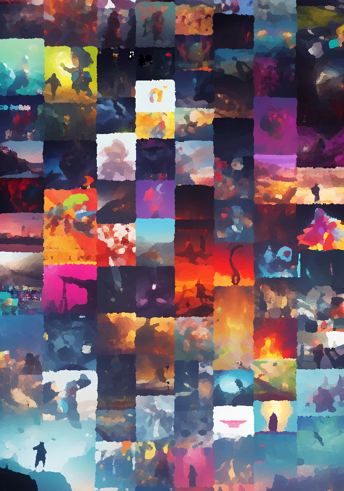
Image to Dots is a Web Application that converts an image into a
series of colored dots. The program is written in JavaScript,
HTML, and CSS.
TRY IT OUT.
The image can be any size, but the larger the image, the longer it will take to process. From testing, higher contrast images work better.
There are lots of settings to tweak to get the image to look how you'd like it. Or you could just mess around with them and have fun.
Once you're happy with the image, you can download it and use it however you'd like.
When I first load the image from the user input, I have to process it into a format that I can use. I use the canvas element to draw the image onto a canvas, then I get the pixel data from the canvas.
I create a set number of dots based on how smoothly I want the program to run (more dots = more lag). And when the dots move, I loop through each dot and set it's position and color based on the pixel data.
function getPixelValue(xPercent, yPercent, imageData) {
    const x = Math.floor(xPercent * imageData.width);
    const y = Math.floor(yPercent * imageData.height);
    const index = (y * imageData.width + x) * 4;

    // return value 0 1
    return imageData.data[index] / 255;
}
What is the value of a pixel?
It's just a number between 0 and 1.
I use the position of the dot to see what color it should be.
I use the position of the dot to get the pixel data from the image. Then I use that pixel data to handle both the dot radius and the dot collision.
function UpdateDotRadius(dot) {
    const {
        position,
        radius
    } = dot;
    const positionPercent = {
        x: help.Clamp(position[0] / dotsAreaCanvas.width, 0.0001, 0.9999),
        y: help.Clamp(position[1] / dotsAreaCanvas.height, 0.0001, 0.9999),
    };
    const pixelValue = getPixelValue(
        positionPercent.x,
        positionPercent.y,
        uploadedImageData
    );

    if (!pixelValue) return;

    // 0 - darkestPixelValue
    // 1 - brightestPixelValue
    const valueRange = brightestPixelValue - darkestPixelValue;
    const relativeValue = (pixelValue - darkestPixelValue) / valueRange;

    const desiredRadius = help.Lerp(
        minDotRadius,
        maxDotRadius,
        dotBezier.GetDotSizeBezierCurve(relativeValue)[1]
    );
    dot.radius += (desiredRadius - radius) * radiusChangeRate;

    dot.detectionRadius = dot.radius + CELL_SIZE * (dot.moveSpeed / dotSpeed);
    dot.collisionRadius = dot.detectionRadius * collisionRadiusMultiplier;
}
Dot collision however, though it may seem as if it is handled by the dot radius, is actually handled by a Boids Algorithm. And really isn't effected by the dot radius.
The Boids Algorithm is a way to simulate flocking behavior. It's used in a lot of games to simulate the movement of birds or fish. It's a very simple algorithm, but it can produce some very interesting results.
The algorithm is split into 3 parts: Alignment, Cohesion, and Separation. Alignment is the average direction of all the nearby dots. Cohesion is the average position of all the nearby dots. And Separation is the average distance of all the nearby dots.
I use these 3 values to calculate the direction of the dot based on certain weights.
function SteerDirection(dot, otherDots) {
    const ratio = 1 - help.Clamp(distance2 / (detectionRadius * detectionRadius), 0, 1);
    direction = direction.map((dir, i) => {
        // turn away from other dot
        dir -= dotsVector[i] * ratio * separationFactor;
        // align with other dot
        dir += otherDot.moveDirection[i] * alignmentFactor;
        return dir;
    });

    // steer away from mouse
    const mouseVector = help.VectorDirection(dot.position, canvasMousePosition);
    direction = direction.map(
        (dir, i) => dir - mouseVector[i] * steerFromMouseFactor * edgeBezier
    );

    // turn towards larger dots
    const dotsVector = help.VectorDirection(dot.position, largestDot.position);
    direction = direction.map(
        (dir, i) => dir + dotsVector[i] * turnTowardsLightFactor
    );

    // apply wind force (-1 left to 1 right)
    direction = direction.map((dir, i) => dir + windFactor * (i === 0 ? 1 : 0));

    // final direction
    const desiredDirection = help.VectorDirection(dot.position, [
      xposAvg,
      yposAvg,
    ]);
    direction = direction.map(
      (dir, i) => dir + desiredDirection[i] * centeringFactor
    );

    return direction;
}
Simplified for viewing purposes.
I use an object to hold all the settings that can be adjusted by the user. This way, I can easily add new settings without having to change the code too much.
class Debug_Settings extends Settings {
    constructor() {
        super();
        this.isDrawingDebug = true;

        this.CELL_SIZE = 50;
        this.dotSpeed = 0.9;
        this.maxDotRadius = 10;
        this.minDotRadius = 0.001;
        this.centeringFactor = 0.1;
        this.alignmentFactor = 0.1;
        this.turnTowardsLightFactor = 0.001;
        this.separationFactor = 1;
    }
}
const debugSettings = new Debug_Settings();
I can extend the class for debug settings...
class MoreDots_Settings extends Settings {
    constructor() {
        super();
        this.CELL_SIZE = 20;
        this.dotsToAdd = 3000;
        this.dotSpeed = 0.5;
        this.maxDotRadius = 10;
        this.minDotRadius = 0.001;
        this.centeringFactor = 0.1;
        this.alignmentFactor = 1;
        this.turnTowardsLightFactor = 0.001;
        this.separationFactor = 1;
        this.slownessFactor = 0.1;
    }
}
Or any other bundle of settings I prefer.
I just have to change the ones I want if I want to make certain packs
The Spatial Grid is a way to reduce the complexity of finding the nearest dot and improves performance. It's a 2D array of lists. Each list contains all the dots that are in that grid cell.
When looping through a large list, each dot has to check every other dot to see if it's going to collide.
But with a spatial grid, the dot only needs to check nearby grid cells.
*EXPLAINED BETTER IN THE VIDEO*
When a dot moves, it checks to see if it's grid cell has changed. If it has, it removes itself from the old grid cell and adds itself to the new grid cell. So when a dot wants to find the nearest dot, it only has to check the dots in it's grid cell and the surrounding grid cells. This is a lot faster than checking every dot on the map.
Using a cell size constant, I can create a grid of cells. This cell size number also dictates how performant the application will be.
Smaller cell size = less dots to check = more performant (but less accurate)
Larger cell size = more dots to check = less performant (but more accurate)
function createGrid(width, height, cellSize) {
    const grid = {};
    for (let i = 0; i < width / cellSize; i++) {
        for (let j = 0; j < height / cellSize; j++) {
        grid[`${i},${j}`] = [];
        }
    }
    return grid;
}
I can get the neighboring cells by adding or subtracting 1 from the x and y values. This way, I can get the 8 cells surrounding the current cell.
function getNeighboringCells(grid, gridPosition, cellSize, canvas) {
    const neighboringCells = [
        `${gridPosition.x},${gridPosition.y}`,
        `${gridPosition.x},${gridPosition.y - 1}`, // this can be undefined
        `${gridPosition.x},${gridPosition.y + 1}`, // this can be undefined
        `${gridPosition.x - 1},${gridPosition.y}`, // this can be undefined
        `${gridPosition.x - 1},${gridPosition.y - 1}`,
        `${gridPosition.x - 1},${gridPosition.y + 1}`,
        `${gridPosition.x + 1},${gridPosition.y}`, // this can be undefined
        `${gridPosition.x + 1},${gridPosition.y - 1}`,
        `${gridPosition.x + 1},${gridPosition.y + 1}`,

        // plus some other math to check for dots looping around the canvas
        // ...
    ];

    return neighboringCells;
}
Using that information, I can get all the dots in the neighboring cells.
function GetDotsInNeighboringCells(dot) {
    const { gridPosition } = dot;
    const neighboringCells = getNeighboringCells(
        grid,
        gridPosition,
        CELL_SIZE,
        dotsAreaCanvas
    );

    const dotsInNeighboringCells = [];

    for (let i = 0; i < neighboringCells.length; i++) {
        if (grid[neighboringCells[i]] === undefined)
            continue;
        const cell = neighboringCells[i];
        const cellDots = grid[cell];
        cellDots.forEach((dot) => {
        dotsInNeighboringCells.push(dot);
        });
    }

    return dotsInNeighboringCells;
}for a cooler explanation